As of 05/01/2026
Indus: 49,499 -152.87 -0.3%
Trans: 20,598 -195.32 -0.9%
Utils: 1,157 -8.12 -0.7%
Nasdaq: 25,114 +222.13 +0.9%
S&P 500: 7,230 +21.11 +0.3%
|
YTD
+3.0%
+18.7%
+8.3%
+8.1%
+5.6%
|
|
As of 05/01/2026
Indus: 49,499 -152.87 -0.3%
Trans: 20,598 -195.32 -0.9%
Utils: 1,157 -8.12 -0.7%
Nasdaq: 25,114 +222.13 +0.9%
S&P 500: 7,230 +21.11 +0.3%
|
YTD
+3.0%
+18.7%
+8.3%
+8.1%
+5.6%
|
|
As of 05/01/2026
Indus: 49,499 -152.87 -0.3%
Trans: 20,598 -195.32 -0.9%
Utils: 1,157 -8.12 -0.7%
Nasdaq: 25,114 +222.13 +0.9%
S&P 500: 7,230 +21.11 +0.3%
|
YTD
+3.0%
+18.7%
+8.3%
+8.1%
+5.6%
| |
|
| ||
Released 8/1/2023.
Below is the updated forecast for 2023 as of the close on August 1, 2023. Captions appear below the pictures for guidance, so be sure to scroll down far enough to read them.
On some of the charts (all except the CPI chart) the prediction in red is based on the work of Edgar Lawrence Smith in the 1930s. Smith said that the stock market followed a 10-year cycle. Each year tended to repeat the behavior of the year a decade earlier. In other words, if you averaged all years ending in 1 (2001, 1991, 1981 and so on), that would give you a forecast for 2011. For 2012, you'd make a similar average, only use 2002, 1992, 1982, and so on. That's what I did for the market forecast charts which follow.
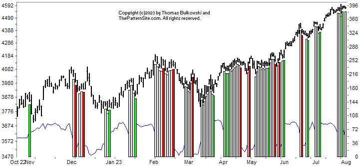
This is a chart of the Chart Pattern Indicator (CPI) on the daily scale.
The indicator slipped to neutral as the white (gray) vertical bar on the far right of the chart shows. It suggests weakness and I expect a retrace is upon us.
For the year, though, the market has been trending higher.
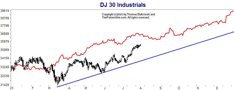
This is a chart of the Dow industrials on the daily scale.
I drew a blue line to show the trend of the industrials when compared to the red line forecast. The slope of both look similar so this year might be one that the forecast mirrors the actual result, at least for the Dow industrials.
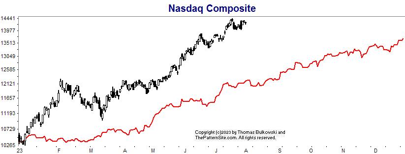
This is the Nasdaq on the daily chart.
The chart shows the index outperforming the forecast by a wide margin. It's well above the predicted end-of-year high.
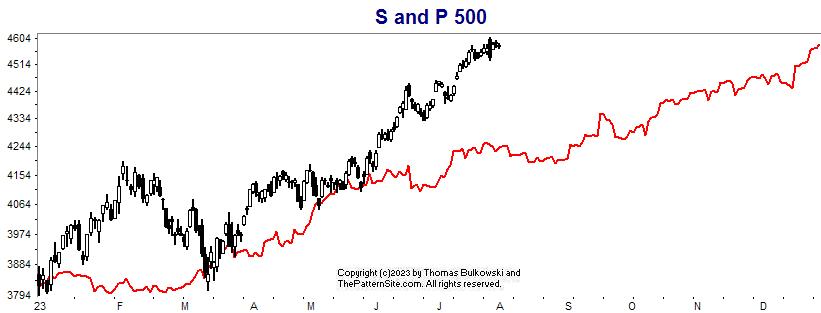
Here's the S&P 500 index on the daily scale.
This chart is similar to the prior one except the year's end in the forecast is similar to today's value in the index.
Support this site! Clicking any of the books (below) takes you to
Amazon.com If you buy ANYTHING while there, they pay for the referral.
Legal notice for paid links: "As an Amazon Associate I earn from qualifying purchases."
|
My Stock Market Books
|
My Novels
Orb Foresight Rewrite Coming!
|