As of 04/15/2026
Indus: 48,464 -72.27 -0.1%
Trans: 20,948 -316.12 -1.5%
Utils: 1,157 -13.84 -1.2%
Nasdaq: 24,016 +376.94 +1.6%
S&P 500: 7,023 +55.57 +0.8%
|
YTD
+0.8%
+20.7%
+8.3%
+3.3%
+2.6%
|
|
As of 04/15/2026
Indus: 48,464 -72.27 -0.1%
Trans: 20,948 -316.12 -1.5%
Utils: 1,157 -13.84 -1.2%
Nasdaq: 24,016 +376.94 +1.6%
S&P 500: 7,023 +55.57 +0.8%
|
YTD
+0.8%
+20.7%
+8.3%
+3.3%
+2.6%
|
|
As of 04/15/2026
Indus: 48,464 -72.27 -0.1%
Trans: 20,948 -316.12 -1.5%
Utils: 1,157 -13.84 -1.2%
Nasdaq: 24,016 +376.94 +1.6%
S&P 500: 7,023 +55.57 +0.8%
|
YTD
+0.8%
+20.7%
+8.3%
+3.3%
+2.6%
| |
|
| ||
Released 7/3/2023.
Below is the updated forecast for 2023 as of the close on July 3, 2023. Captions appear below the pictures for guidance, so be sure to scroll down far enough to read them.
On some of the charts (all except the CPI chart) the prediction in red is based on the work of Edgar Lawrence Smith in the 1930s. Smith said that the stock market followed a 10-year cycle. Each year tended to repeat the behavior of the year a decade earlier. In other words, if you averaged all years ending in 1 (2001, 1991, 1981 and so on), that would give you a forecast for 2011. For 2012, you'd make a similar average, only use 2002, 1992, 1982, and so on. That's what I did for the market forecast charts which follow.
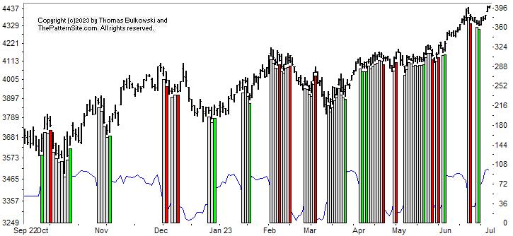
This is a chart of the Chart Pattern Indicator (CPI) on the daily scale.
The CPI shows green, which is bullish. The signal happened long enough ago that it won't change (meaning the signal can change for up to a week). The market has responded nicely to the bullish signal by rising.
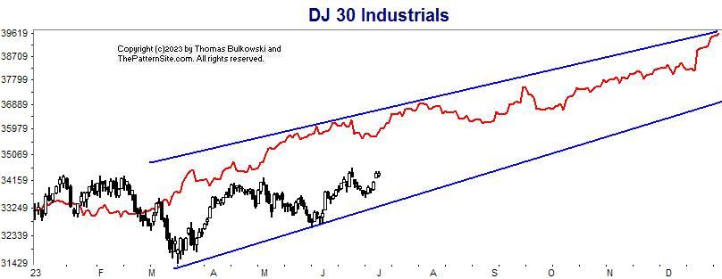
This is a chart of the Dow industrials on the daily scale.
The black candles are the Dow. The red line is the forecast, and I drew blue lines to show the slope of the Dow's trend.
Notice how the top and bottom blue lines have a similar slope. In other words, if the forecast were lowered to where the Dow is today, we might see it close the year near 37,800 (if it follows the forecast).
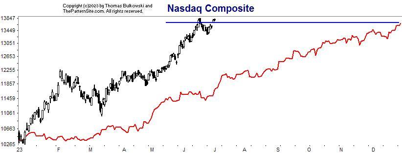
This is the Nasdaq on the daily chart.
I drew a horizontal blue line to emphasize that the Nasdaq is above the forecast close for the year. In other words, the index is doing better than expected.
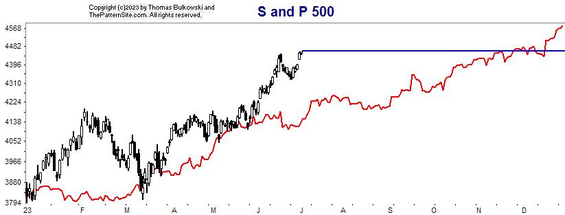
Here's the S&P 500 index on the daily scale.
This is similar to the prior chart. The S&P index has a bit to go to reach the predicted close.
If the forecast is correct, then look for the index to go horizontal to slightly up to reach the predicted close.
Support this site! Clicking any of the books (below) takes you to
Amazon.com If you buy ANYTHING while there, they pay for the referral.
Legal notice for paid links: "As an Amazon Associate I earn from qualifying purchases."
|
My Stock Market Books
|
My Novels
Orb Foresight Rewrite Coming!
|