As of 05/04/2026
Indus: 48,942 -557.37 -1.1%
Trans: 19,606 -992.51 -4.8%
Utils: 1,153 -4.13 -0.4%
Nasdaq: 25,068 -46.64 -0.2%
S&P 500: 7,201 -29.37 -0.4%
|
YTD
+1.8%
+13.0%
+7.9%
+7.9%
+5.2%
|
|
As of 05/04/2026
Indus: 48,942 -557.37 -1.1%
Trans: 19,606 -992.51 -4.8%
Utils: 1,153 -4.13 -0.4%
Nasdaq: 25,068 -46.64 -0.2%
S&P 500: 7,201 -29.37 -0.4%
|
YTD
+1.8%
+13.0%
+7.9%
+7.9%
+5.2%
|
|
As of 05/04/2026
Indus: 48,942 -557.37 -1.1%
Trans: 19,606 -992.51 -4.8%
Utils: 1,153 -4.13 -0.4%
Nasdaq: 25,068 -46.64 -0.2%
S&P 500: 7,201 -29.37 -0.4%
|
YTD
+1.8%
+13.0%
+7.9%
+7.9%
+5.2%
| |
|
| ||
Released 8/1/2023.
Below is the updated forecast for 2023 as of the close on August 1, 2023. Captions appear below the pictures for guidance, so be sure to scroll down far enough to read them.
On some of the charts (all except the CPI chart) the prediction in red is based on the work of Edgar Lawrence Smith in the 1930s. Smith said that the stock market followed a 10-year cycle. Each year tended to repeat the behavior of the year a decade earlier. In other words, if you averaged all years ending in 1 (2001, 1991, 1981 and so on), that would give you a forecast for 2011. For 2012, you'd make a similar average, only use 2002, 1992, 1982, and so on. That's what I did for the market forecast charts which follow.
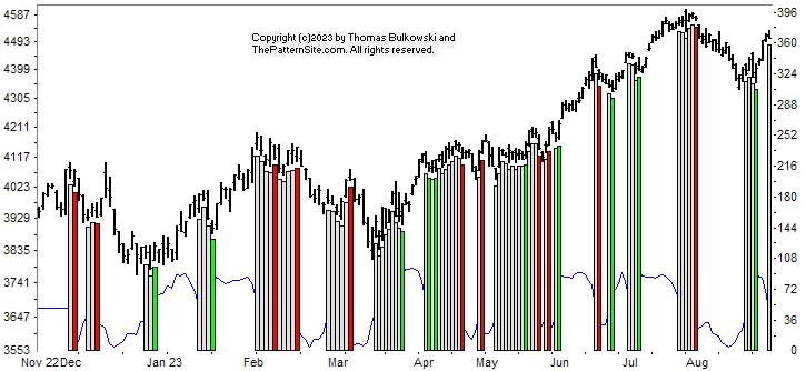
This is a chart of the Chart Pattern Indicator (CPI) on the daily scale.
The CPI changed from bullish to neutral as the white vertical bar on the far right of the chart shows. It looks like the index might form a double top (not confirmed, but a second top near the price of the first one).
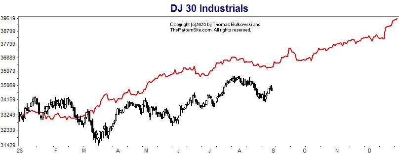
This is a chart of the Dow industrials on the daily scale.
The forecast of the Dow made back in January appears as the red line. The slopes of the Dow and the red line appear similar even though performance so far this year for the Dow has been below the prediction.
It's still on track to end the year higher than where it started.
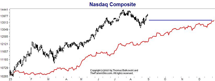
This is the Nasdaq on the daily chart.
The Nasdaq has outperformed the forecast so far. It has already exceeded the end-of-year forecast as the blue horizontal line shows.
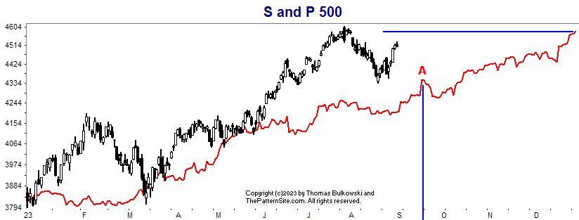
Here's the S&P 500 index on the daily scale.
The S&P has exceeded the forecast but hasn't quite met the forecasted close (horizontal blue line). Note at A, about mid September, look for the index to peak and then drop toward the end of the month.
If that's accurate, it could be a buying opportunity as we near October. Notice that October ends higher than where it began and we continue mostly higher to year end.
Support this site! Clicking any of the books (below) takes you to
Amazon.com If you buy ANYTHING while there, they pay for the referral.
Legal notice for paid links: "As an Amazon Associate I earn from qualifying purchases."
|
My Stock Market Books
|
My Novels
Orb Foresight Rewrite Coming!
|