As of 03/27/2026
Indus: 45,167 -793.47 -1.7%
Trans: 18,175 -194.01 -1.1%
Utils: 1,152 +3.84 +0.3%
Nasdaq: 20,948 -459.72 -2.1%
S&P 500: 6,369 -108.31 -1.7%
|
YTD
-6.0%
+4.7%
+7.8%
-9.9%
-7.0%
|
|
As of 03/27/2026
Indus: 45,167 -793.47 -1.7%
Trans: 18,175 -194.01 -1.1%
Utils: 1,152 +3.84 +0.3%
Nasdaq: 20,948 -459.72 -2.1%
S&P 500: 6,369 -108.31 -1.7%
|
YTD
-6.0%
+4.7%
+7.8%
-9.9%
-7.0%
|
|
As of 03/27/2026
Indus: 45,167 -793.47 -1.7%
Trans: 18,175 -194.01 -1.1%
Utils: 1,152 +3.84 +0.3%
Nasdaq: 20,948 -459.72 -2.1%
S&P 500: 6,369 -108.31 -1.7%
|
YTD
-6.0%
+4.7%
+7.8%
-9.9%
-7.0%
| |
|
| ||
Updated and added 10 examples on 7/16/25.
The broadening bottom is one of those chart patterns that appears often, but its performance rank is mid list or worse. The break even failure rate ranks 25 out of 39 where 1 is best. The broadening bottom has one redeeming value and that is the partial decline which does a good job of predicting an upward breakout.
$ $ $
For detailed information on this chart pattern, read Encyclopedia of Chart Patterns, 3rd Edition (#ad). If you click the link and then buy the book (or anything) while at Amazon.com, the referral will help support this site. Thanks. -- Tom Bulkowski
$ $ $
The picture shows a broadening bottom with a partial rise, not a partial decline. Go figure. ![]()
 Broadening Bottom
|
|
The above numbers are based on 599 perfect trades for upward breakouts and 405 for downward breakouts. See the glossary for definitions.
| Characteristic | Discussion |
| Price trend | Downward leading to the pattern. That is, the closing price at the trend start is above the close at the pattern's start. |
| Shape | Higher peaks and lower valleys -- a megaphone shape. |
| Trendlines | The top trend line slopes upward, the bottom one slopes downward. |
| Touches | At least five touches total, three peaks or three valleys should touch the associated trend line with two or more touches of the other trendline. Ideally, the second of three touches will touch (instead of coming 'close' to) the trendline. This avoids the identification problem where price forms a down-sloping channel with an upward spike at pattern's end. See the next section. |
| White space | Price should cross the pattern from side to side, filling the area with price movement. See the next section. |
| Volume | Upward 65% (up breakouts) to 67% (down breakouts) of the time. |
| Breakout | Can occur in any direction (upward 60% of the time) and it happens when price pierces a trendline or moves above/below the top/bottom of the pattern. |

Here's an example of an identification mistake. I show the same time period in both halves of the chart.
In the left half, I show what appears to be a broadening bottom. Price trends downward into the pattern and then broadens out. Price touches the bottom trendline three distinct times (numbered) with the middle touch (2) falling a bit short of the line, but it's close enough. The top trendline has a two touches at the start (1, 2) and a few more at the end (3, 4). It looks like price is broadening out. But there's one problem.
It's not a broadening bottom.
If peak A touched the top trendline, then it would be a nicely shaped broadening bottom.
Look at the right half of the chart. Here I drew a channel, outlining price movement. Clearly this is not a broadening pattern. It's just a down trend followed by an up trend.

Compare the prior example with this one, shown on the right.
Price crosses the pattern from top to bottom in minor high and minor low touches. This example has five touches on the top and three on the bottom.
Price fills the white space with movement.
It looks like a broadening pattern.
Point A shows a partial decline. Price drops but doesn't touch the bottom trendline before reversing and staging an immediate upward breakout in this example.
Consult the associated figure on the right.
| Trading Tactic | Explanation | 
The Measure Rule
|
| Measure rule | Compute the difference between the highest peak (A) and lowest valley (B) in the pattern to get the height. Add the height to the pattern's top (for upward breakouts, works 65% of the time) or subtract it from the pattern's bottom (downward breakouts, works 41% of the time). Or multiply the height by the 'percentage meeting price target' (see Important Bull Market Results) and add it to the highest peak (A, upward breakout) or subtract it from the lowest valley (B, downward breakout) to get a price target, D or E, respectively. | |
| Intraformation trade | Buy when price rebounds off the lower trendline (C), and short at the top (A) when price heads down. | |
| Buy at 3rd touch | When price touches the bottom trendline for the third time (C) and begins rising, buy. | |
| Short at the top | When price touches the top trendline and begins falling (A), sell or sell short. | |
| Partial rise | A partial rise works 53% of the time. | |
| Partial decline | A partial decline works 73% of the time. | |
| Price trend | The best performing patterns with upward breakouts are those with an intermediate-term (3-6 months) decline leading to the pattern (from the trend start). | |
| Yearly range | Upward and downward breakouts perform best when the breakout is within a third of the yearly low. | |
| Volume trend | Does best when volume trends upward (within the pattern) for both breakout directions. | |
| Breakout | The breakout direction is upward 60% of the time. | |
| Throwbacks and pullbacks | Both hurt performance when they appear. The links on the left define terms and these links discuss performance for throwbacks and pullbacks |
| Breakout Direction | 1990s | 2000s | 2010s |
| Up (average) | 40% | 46% | 46% |
| Down (average) | 17% | 14% | 14% |
The above table shows the performance of broadening bottom chart patterns in bull markets over the last three decades.
The 1990s show the pattern performing worse than the two recent decades (for upward breakouts) or marginally better performance for downward breakouts.
A check of the failure rates (not shown) have been stable for upward breakouts, which is reassuring, but downward breakouts have seen failures more than double in the last 2 decades compared to the 1990s.

The associated figure shows an example of a broadening bottom chart pattern on the daily scale. Price begins the broadening bottom at A and forms diverging peaks and valleys.
This example is not ideal because of the gap between peak B and the top trendline. In this example, however, it's close enough to qualify as a broadening bottom.
Notice that if you draw the top trendline to connect point B instead of C, the pattern would take on the appearance of a right-angled and descending broadening formation because the top trendline would be flat or nearly so. Also, price at E bounces to D and then makes a lower low at F. Point D looks like a partial rise which fails when the predicted breakout at F does not occur. This is one example of why trading broadening bottoms for profit is difficult, even if relying on a partial decline or partial rise.
At the end of the broadening bottom, C, a partial decline occurs which correctly predicts an upward breakout. This allowed astute traders early entry.
Below are some of the lessons I learned from trading these patterns over the decades. You can use the Patternz simulator to reproduce the charts in full. I downloaded the data from Tiingo but not all stocks currently trade.
I present the information in slider format, so be sure to click the left or right arrows to view another slide.
Please note: These tips are for swing traders or even scalpers, those who want to trade from low to high or skim off a few bucks, and not for buy-and-hold investors.

This is a chart of ARW (Arrow Electronics) on the daily scale with a broadening bottom from 2/28/2011 to 3/21/2011. This is the landscape that I like to see for broadening bottoms. The price trend leading to the start of the chart pattern is upward even though it drops into the broadening bottom (which is why it's a bottom and not a top pattern). The uptrend is the key. If you can catch it early in the start of this type of uptrend, obviously that's best.
In this case, there was still profit opportunity after the breakout and before it headed lower to the red trendline and below. I happened to exit at the ultimate high for the stock.

CCK, (Crown Holdings, broadening bottom from 4/1/2011 to 5/2/2011). Here's an example of a long-term uptrend but this broadening bottom failed. Notice the fast move up from the last bottom to the last top of the chart pattern. We'll see that these types or fast rises often lead to a reversal (like you see here). If you set a buy stop a penny above the top of the chart pattern, in this case, it wasn't hit, so this wasn't a losing trade (because the buy stop never triggered).

ADP (Automatic Data Processing, 8/18/2020 to 9/3/2020). This is a busted broadening bottom (according to Patternz, but it looks like a broadening top to me).
In a good many cases, the stock will breakout downward. I just sit and wait and if I see it curl back up, I'll consider placing a buy stop a penny above the top of the chart pattern.
As you can see, the blue dot highlights the buy and the red dot shows the sale. Consider buying busted broadening bottoms.

AXE (Anixter International, but it no longer trades. 5/16/2017 to 9/29/2017). The fast rise from A to B signals a failure. Why? Ask yourself how much higher could the stock rise? Even if the stock triggered an entry, I'd be worried about a retrace down to the middle of the AB run. That's too far down to be worth risking a hold. To put it another way, we have a strong move up from A to B and then we run into overhead resistance setup by the pattern's trendline. In this case, the stock stalled there and eventually the upward breakout failed.
I avoid these types of situations. Coupled with the multipeak, it was a classic bearish top trap.
If you placed a buy stop a penny above the pattern, you would likely have been stopped out or siting on a tidy loss when the stock plummeted. Avoid buying after a strong move up in a broadening bottom like you see here from A to B.

CL (Colgate-Palmolive, 2/27/2018 to 3/29/2018) shows another example of a quick rise (circled) leading to a buy signal that fails. The upward run is short, but lethal.
This is another example of a multipeak pattern with a bullish chart pattern at the end of it, but it's a trap.

ADSK (Autodesk Inc, 8/26/2014 to 9/19/2014) shows another version of a multipeak pattern followed by a bullish breakout from a broadening bottom that fails to see price rise as expected. Do avoid these types of traps.

This is a broadening bottom (5/22/2018 to 6/14/2018) where you'd expect to find one, in a downtrend. However, there's a big tendency for the downtrend to continue after the pattern ends. That's what happens in BG (Bunge LTD) when price triggered a buy stop but then reversed and continued lower, below the bottom of the pattern.

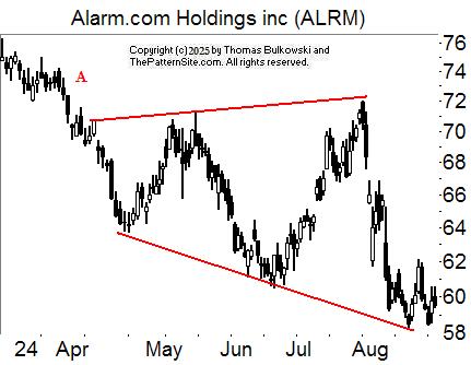
ALRM (Alarm.com, 5/26/2021 to 8/6/2021). Here's another example of a broadening bottom that comes after a downtrend. This one breaks out downward and it ended much lower (not shown).
That's the problem with bottom fishing. You don't know where the bottom is. It's better to wait for the stock to put in a bottom and begin rising before you become bullish on it.

BBBY (Bed Bath & Beyond, 7/13/2012 to 7/27/2012). This chart shows the dangers of trading a stock with a dead-cat bounce event pattern. I show two of them but I didn't qualify them for their height (which is usually a minimum of a 15% decline from close to low).
If you bought this broadening bottom, you'd have made money for a time, but if you didn't sell, you'd be holding a losing position, at least for a time (off the chart to the right, the stock moves up).

AEP (American Electric Power, 11/17/2015 to 12/17/2015). Price moves horizontally for almost a year before a broadening bottom pattern appears. This support area provides a good liftoff for the stock and it responds by climbing.
The following is a slide show. Click the right or left arrows, or the circles below the chart to navigate around the slides.
The broadening bottom is highlighted in red. At A, the inbound trend is downward, confirming that this chart pattern is a bottom.

Another broadening bottom example.

Another broadening bottom example.

Another broadening bottom example. This broadening bottom has a partial decline at A. Partial declines correctly predict an immediate upward breakout 73% of the time for broadening bottoms. However, in this example, it did correctly predict an upward breakout but the breakout wasn't immediate (price touched the top trendline and should have broken out upward there but it dropped instead).

Another broadening bottom example.

This broadening bottom has a downward breakout at B (a close below the green line, which I drew at the bottom of the broadening bottom). At A, price closed below the top of the broadening bottom, so it wasn't an upward breakout.

Another broadening bottom example.

Another broadening bottom example.

Another broadening bottom example.

Another broadening bottom example except this has what I call undershoot just before the start of the broadening bottom (at A). The brief dip doesn't hide that the longer-term inbound price trend is downward.
-- Thomas Bulkowski
Support this site! Clicking any of the books (below) takes you to
Amazon.com If you buy ANYTHING while there, they pay for the referral.
Legal notice for paid links: "As an Amazon Associate I earn from qualifying purchases."
|
My Stock Market Books
|
My Novels
Orb Foresight Rewrite Coming!
|
The only difference between this place and the Titanic is the Titanic had a band.![]()