As of 04/29/2026
Indus: 48,862 -280.12 -0.6%
Trans: 20,531 -201.52 -1.0%
Utils: 1,143 -14.34 -1.2%
Nasdaq: 24,673 +9.44 +0.0%
S&P 500: 7,136 -2.85 0.0%
|
YTD
+1.7%
+18.3%
+7.0%
+6.2%
+4.2%
|
|
As of 04/29/2026
Indus: 48,862 -280.12 -0.6%
Trans: 20,531 -201.52 -1.0%
Utils: 1,143 -14.34 -1.2%
Nasdaq: 24,673 +9.44 +0.0%
S&P 500: 7,136 -2.85 0.0%
|
YTD
+1.7%
+18.3%
+7.0%
+6.2%
+4.2%
|
|
As of 04/29/2026
Indus: 48,862 -280.12 -0.6%
Trans: 20,531 -201.52 -1.0%
Utils: 1,143 -14.34 -1.2%
Nasdaq: 24,673 +9.44 +0.0%
S&P 500: 7,136 -2.85 0.0%
|
YTD
+1.7%
+18.3%
+7.0%
+6.2%
+4.2%
| |
|
| ||
Statistics updated and 10 examples added: 8/20/25.
Think of an ugly double bottom as a double bottom in which the second bottom is significantly higher than the first. Ugly double bottoms can help you time the entry when bottom fishing.
The average rise is slightly better than for all double bottoms (41% for ugly double bottoms versus 37% regular double bottoms) but the failure rate is about the same, 15% (ugly double bottoms) versus 16% for all double bottoms. The following statistics are based on a study of 4,376 patterns found in 1,326 stocks from July 1991 to July 2025. Discovered by Thomas N. Bulkowski in March 2006.
$ $ $
My book, Encyclopedia of Chart Patterns, 3rd Edition takes an in-depth look at 76 charts, including performance statistics. However, it does not include ugly double bottoms. I wonder why I left it out...
If you click on the above link and then buy the book (or anything) while at Amazon.com, the referral will help support this site. Thanks.
$ $ $

Ugly Double Bottom Chart Pattern
|
The above numbers are based on 4,376 perfect trades. See the glossary for definitions.
| Characteristic | Discussion |
| Price trend | The inbound primary (long term) trend direction, when up, gives slightly better performance. |
| Shape | Looks like a double bottom with unequal bottoms. The second bottom should be between 5% and 15% higher than the first, and a consecutive minor low (no intervening low). |
| Volume | Recedes 80% of the time |
| Breakout | Upward when price closes above the highest high between the two bottoms. |
| Confirmation | The pattern confirms as valid when price closes above the peak between the two bottoms. If price does not close above the confirmation price then it's not an ugly double bottom. |

As an example, consider the figure to the right. Points 1 and 2 show the two bottoms after a price downtrend. The pattern becomes a true ugly double bottom when price closes above the horizontal blue line (the word Buy points to it in the figure).
You may think that points A and B also form an ugly double bottom, but they do not. Price does not close above C (the highest high between the two bottoms, shown as the green line) before making a new low at D. That is a very important distinction. Price must rise above the highest high between the two bottoms to confirm the ugly double bottom as a valid chart pattern. Otherwise, you just have more squiggles on the price chart.
![]() More (#ad)
More (#ad)
| Trading Tactic | Explanation |  The Measure Rule
|
| Measure rule | Compute the height from the highest peak (point C in the Measure Rule figure to the right) to the left bottom low (A) then multiply it by the above 'percentage meeting price target.' Add the difference to the breakout price (the price of the highest high between the two bottoms, C) to get a price target. | |
| Second Low | The second bottom (the right one, B, in the Measure Rule figure to the right) should be at least 5% above the left one (A). | |
| Trend | The best performance comes from short-term (0-3 months) trends leading to the chart pattern. | |
| Reversal | The pattern acts as a reversal of the downtrend. | |
| Volume trend | If volume slopes upward (between the two bottoms), the pattern tends to perform better. | |
| Avoid yearly low | Patterns with breakouts within a third of the yearly low tend to under perform. |
To improve performance, look for patterns with breakout day volume above the 30-day average (heavy breakout volume).
![]() More (#ad)
More (#ad)

The figure to the right shows the preferred setup. The decline begins at point 1, usually several months before the ugly double bottom. As price nears the ugly double bottom, it declines at a faster rate, usually forming a straight-line run that approximates 45 to 60 degrees (points 2 to 3). This is the blow-off stage and it usually lasts at least a month, often 6 weeks or so. The panic selling ends at 3 and a bounce occurs which takes price back up to 4, forming the second bottom of an unconfirmed ugly double bottom.
After point 4, it should take several days (11 is the average) for an upward breakout to occur in a strong push upward on high volume. Price usually continues in a strong advance upward. If you see price rounding over and closing below a trendline formed by joining points 3 and 4 and projected upward (the green sell line, but only if the line is shallow (say, 30 degrees or less)), then consider selling. Unless the trendline is unusually steep, a close below the trendline means the primary decline has work left to do and price is going lower. Save your bucks and sell immediately. Otherwise, watch the rise and monitor the 3-4 trendline. Many times, price will break this trendline several months later when the rise ends. That's the time to sell.
![]() More (#ad)
More (#ad)

The above figure shows an example of an ugly double bottom chart pattern. Price moves nearly horizontally during October and into November and then takes a dive to the first low at 1. A higher low occurs at 2, forming the ugly double bottom, confirmed when price closes above the blue confirmation line. A throwback occurs but it does not close below a line connecting bottoms 1 and 2.
![]() More (#ad)
More (#ad)
I present the information in slider format, so be sure to click the left or right arrows to view another slide.

This chart shows the stock gapping downward (at A) before the ugly double bottom forms. Should you take the trade? My answer was "no." Why? Because of the gap down. That happened on bad news (I'm assuming. I didn't check but the market reacted to it by dropping). The stock recovered over the next three months before gapping down again. Because the spread was 3 months between the two gaps, the gaps could be due to a bad earnings surprise. The stock never made it to the measure rule target before failing.

This is a trade I didn't take because of the multi-peak pattern. I underlined the peak in red (it's a head-and-shoulders top, too). The bottom of this pattern looks formidable from a resistance perspective. As the chart shows, the stock moved up and reached the ultimate high (green dot) but fell short of the measure rule sell target. The stock eventually cratered for a loss.

This is a chart which shows a long tail (or spike, as it's called, circled). In this case, the downward plunge is bullish because the bulls drive price back up to close near the top of the day's price range. It suggests bulls will remain in command. And they do, resulting in a winning trade.

This is another example of a multi-peak disaster. I circled the multi-peak in red but resistance to an upward move extends to the right as the horizontal red line shows. The stock hits that resistance and tumbles to form the ugly double bottom. The stock climbs to the ultimate high (green dot) and then sinks. It does not reach the measure rule target.
![]() More (#ad)
More (#ad)
The following is a slide show. Click the right or left arrows, or the circles below the chart to navigate around the slides.
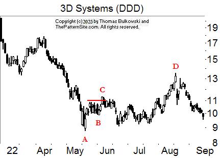
AB is the ugly double bottom. C is confirmation where the squiggles turn into a valid chart pattern. D is the ultimate high, the highest price reached before the stock drops by at least 20%.

AB is the ugly double bottom.

AB is the ugly double bottom. To the left of C is the ultimate high.

AB is the ugly double bottom. This ugly pattern happened in an upward, so the chart pattern acted as a continuation and not a reversal.

AB is the ugly double bottom. C is the ultimate high.

AB is the ugly double bottom. Connecting AB with a trendline as a sell signal, depending on how accurately you draw it, would have signaled a sell near C.

AB is the ugly double bottom.

AB is the ugly double bottom.

AB is the ugly double bottom. D is a throwback. C is the ultimate high.

AB is the ugly double bottom.
-- Thomas Bulkowski
![]() More (#ad)
More (#ad)
Support this site! Clicking any of the books (below) takes you to
Amazon.com If you buy ANYTHING while there, they pay for the referral.
Legal notice for paid links: "As an Amazon Associate I earn from qualifying purchases."
|
My Stock Market Books
|
My Novels
Orb Foresight Rewrite Coming!
|
Lottery: a tax on people who are bad at math.![]()