As of 03/26/2026
Indus: 45,960 -469.38 -1.0%
Trans: 18,369 -72.36 -0.4%
Utils: 1,148 +7.85 +0.7%
Nasdaq: 21,408 -521.75 -2.4%
S&P 500: 6,477 -114.74 -1.7%
|
YTD
-4.4%
+5.8%
+7.5%
-7.9%
-5.4%
|
|
As of 03/26/2026
Indus: 45,960 -469.38 -1.0%
Trans: 18,369 -72.36 -0.4%
Utils: 1,148 +7.85 +0.7%
Nasdaq: 21,408 -521.75 -2.4%
S&P 500: 6,477 -114.74 -1.7%
|
YTD
-4.4%
+5.8%
+7.5%
-7.9%
-5.4%
|
|
As of 03/26/2026
Indus: 45,960 -469.38 -1.0%
Trans: 18,369 -72.36 -0.4%
Utils: 1,148 +7.85 +0.7%
Nasdaq: 21,408 -521.75 -2.4%
S&P 500: 6,477 -114.74 -1.7%
|
YTD
-4.4%
+5.8%
+7.5%
-7.9%
-5.4%
| |
|
| ||
Updated 1/5/2026.

This is a chart of the Dow industrials forecast for 2026.
It shows the Dow closing 15% higher for the year. The Dow will be flat (not gaining ground) for about a third of the year until late July when it begins to make new highs.
If you want to buy the dip, then you'll have an opportunity about three weeks into January (providing the forecast is correct).
![]()
Below is the forecast for the years since 2008, presented in slider format (think slide show). Captions appear below the pictures for guidance, so be sure to scroll down far enough to read them. Use the arrows on the left and right side of the chart to advance to the next slide (or go back one slide). The circles at the bottom of the chart allow you to move from slide to slide easily. Click on the circle to be taken to the associated slide.
The forecast is the red line and it's based on the work of Edgar Lawrence Smith in the 1930s. Smith said that the stock market followed a 10-year cycle. Each year tended to repeat the behavior of the year a decade earlier. In other words, if you averaged all years ending in 1 (2001, 1991, 1981 and so on), that would give you a forecast for 2011. For 2012, you'd make a similar average, only use 2002, 1992, 1982, and so on. That's what I did for the market forecast charts which follow.

This is the Dow industrials on the daily scale in 2008.
This was another year that the index and the prediction missed each other. The Dow dropped even as the prediction said it would rise. If you invert the prediction, it would have been closer to reality.

This is the Dow industrials on the daily scale in 2009.
Although the prediction ended the year very close to the actual, it missed the large decline in March.

This is the Dow industrials on the daily scale in 2010.
The prediction was off this year. The drop predicted to start in September and bottom in October never appeared.

This is the Dow industrials on the daily scale in 2011.
The prediction did quite well in 2011. It may have peaked or hit a valley a few weeks out of synch, but it did predict a bumpy year.

This is the Dow industrials on the daily scale in 2012.
In May, the prediction headed lower, but the Dow turned up in June.

This is the Dow industrials on the daily scale in 2013 and how it was predicted to do. Both the prediction and the Dow start the year from the same value.
The method predicted that the year would be a good one for the Dow. It was.

This is the Dow industrials on the daily scale in 2014.

This is the Dow industrials on the daily scale in 2015 (black) and the predicted path (red) of the Dow.

This is the forecast for the Dow in 2016 (red), using the daily scale, accompanied by the actual Dow price action (black). Notice how close the predicted value was to the actual. Wow.

The red line is the forecast for 2017 and the black bars are the Dow industrials on the daily scale. The actual close at year end versus the predicted close I show in the upper right of the chart.

The red line is the forecast for 2018 and the black bars are the Dow industrials on the daily scale.
Earlier in 2008, probably around the August blog post, I received an email questioning the inclusion of 2007-2009 bear market data in the forecast. I thought the person made a good case, that the 2008 bear market wouldn't recur this year. So I removed the bear market data and posted the results.
Clearly that was a mistake. If you include the 2008 bear market data in the forecast, then the above chart is what you get.
Notice that if you invert the red line, it tracks quite closely the Dow industrials. The ending close isn't the same, but it's a very good prediction in my view.
Unfortunately, I've no idea ahead of time whether we'll need to invert the forecast or not.

This is the forecast (red line) and actual performance for 2019.

This is the forecast (red line) and actual performance for 2020. The COVID-19 pandemic took the markets down in a swift but short bear market in March, as the chart shows. The recovery was swift, though, as the markets looked to the future.

This is the Dow Industrials in black and the prediction in red. The forecast missed the actual move by 5,500 points or 18%. The forecast looked dismal at the start of the year going forward even as the Dow moved higher. In September, the forecast began its recovery but it wasn't strong enough to catch up with the Dow.
This is the predicted path of the Dow industrials this year. The industrials are predicted to rise to mid February, drop to mid March, and recover to post the year's high in May.
After May, it's downhill to the September low. Following that, we get a bounce to end the year slightly above where we started.
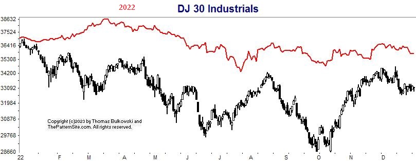
This is a chart of the Dow industrials on the daily scale. The 2022 forecast is in red, made in January 2022.
The forecast suggested the industrials would end the year lower and they did. The waveform of the red and black lines are similar in shape but the extent of the black OHLC chart has steeper hills and valleys compared to the red line. The index was forecast to close the year at 35,531 but it actually closed it at 33,147.
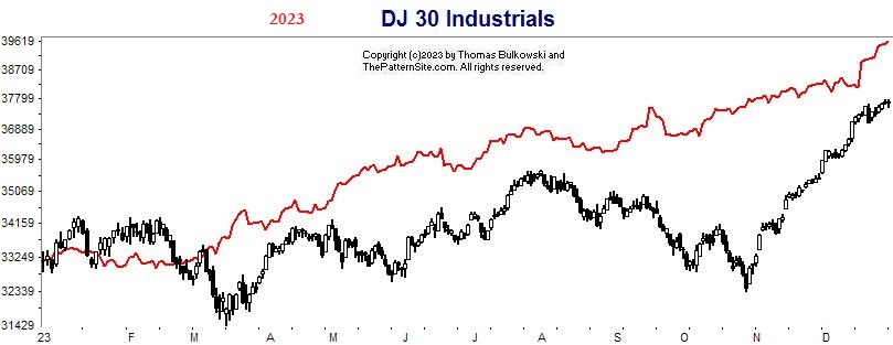
This is a chart of the Dow industrials on the daily scale for 2023. It shows that the forecast (red line, made before the year started) was a smooth line trending higher whereas the index was more choppy.
The actual Dow close was close to the forecasted one.

This is what happened to the Dow industrials in 2024 compared to the forecast made in January for the year. As you can see the index climbed away from the forecast to end the year 13% higher.

This chart shows what happened to the Dow in 2025. The ending year forecast was off and the up/down waves in the middle were missing, too.
Support this site! Clicking any of the books (below) takes you to
Amazon.com If you buy ANYTHING while there, they pay for the referral.
Legal notice for paid links: "As an Amazon Associate I earn from qualifying purchases."
|
My Stock Market Books
|
My Novels
Orb Foresight Rewrite Coming!
|